Videos
Videos
Logo Design Theory: How Branding Design Really Works
Preface to Logo Design Theory Video Course
Introduction to Logo Design Theory
Are there unchanging, bedrock principles of branding design that can be learned and practiced to create identities that might last their clients forever? Yes! This free video course will lay it out, step-by-step. Based on the book, Logo Design Theory. About this book, the great identity designer Ivan Chermayeff said, "at last, somebody understands what identity design is all about and how it is accomplished."
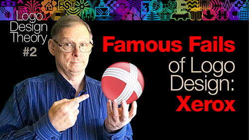
Famous Fails in Logo Design: Xerox
The 2005 Xerox logo was not designed in conformity to the Core Principles of Logo Design, and consequently, did not reproduce well in a multitude of situations where any logo should be able to reproduce. Learn what went wrong.
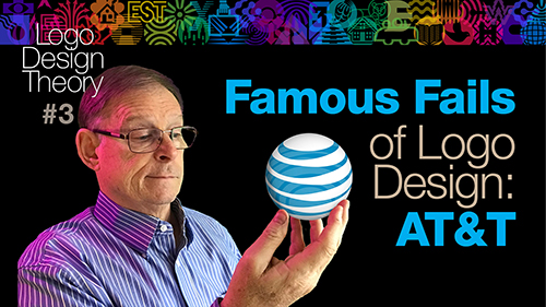
Famous Fails in Logo Design: AT&T
AT&T had a timeless logo from Saul Bass designed according to the Core Principles of logo design. In 2005 they replaced it with a much weaker logo that cost them much more money in implementation. After struggling with this inferior logo for years, they finally went back to a logo that conforms to the Core Principles. See for yourself.
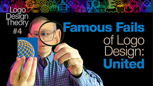
Famous Fails Logo Design: United Airlines
Continental Airlines got a terrible logo in 1991 that did not reproduce well. When United and Continental airlines completed their merger in 2012, They kept the name United and the inferior Continental logo. After struggling with this flawed design for 7 years they finally had it revamped.
Before You Begin
Logo Design Theory
It is human nature to jump in the deep end, eat your dessert before your vegetables and to skip the fundamentals and dive right into the really meaty bits. I ask you to do it the right way. Give yourself a good foundation of design essentials, then branding perspective. And then, suitably prepared, you will understand better the Core Principles of logo design.
1 Foundational Priniples of Graphic Design

Seeking True Principles
In Art and Design
There are true principles in every area of artistic endeavor including branding design. I won’t pretend to know them all, but I’m sure I’ve discovered at least a few. Those are what I want to share in these videos. It doesn’t matter where knowledge comes from; when we find true principles, we would do well to adopt them.
Professional, Prima Donna or
Artsy-Fartsy
A professional is a person who can do a good job and who works in good faith for the benefit of his or her client. A professional puts the client above self. He or she takes appropriate pride in putting the job first and in being capable of consistent excellence. The humility is recognition that the performer is not the center of attention. The performance is.
Five Myths About Creativity
.
Some of ideas on creativity are as fanciful as frog feathers. I’m not claiming that frog feathers aren’t real. Maybe they are. All I know is that all frogs of my acquaintance have no feathers. Likewise, many of these notions about creativity are quite different from my experiences. Sometimes it helps to define something by eliminating things that are confused with it. That exercise will be particularly useful in our discussion of creativity. Let’s dispel some creativity myths.
What is the Purpose
of Graphic Design?
Few people correctly understand the purpose of graphic design. We should not expect it of people outside our profession, but how few graphic design students or even working professionals grasp this principle? Understanding this simple truth will give clarity to so much of what we try to do.

Form Follows Function
It is sometimes easy to get distracted from the essential function of a creative project. This is especially true when esthetics are also an integral part of the function, as with corporate identity. But esthetics are not the only function of a corporate identity. Clear thinking must override gut impulses in this area.
Basic Principles of Graphic Design
It is human nature to jump in the deep end, eat your dessert before your vegetables and to skip the fundamentals and dive right into the really meaty bits. I ask you to do it the right way. Give yourself a a good foundation of design essentials, then branding perspective. And then, suitably prepared, you will understand better the Core Principles.
Legibility and Contrast
When we can see and read what is written or perceive the elements of a picture, we call that legibility. Legibility is a function of contrast. Achieving this is easy if you know the basic principles.
Color and Contrast
Every color has a value as well as hue and saturation. This is the key to avoiding five common contrast mistakes designers make with color.
The Doctrine of
Coincide or Contrast
Simply put, elements in a design should either coincide or contrast. This basic doctrine will answer a wide range of design questions. Here we will only deal with type and layout.
2 Branding Fundamentals
The Doctrine of
Coincide or Contrast
Branding design is not a modern pursuit. We can learn much by looking at the branding forms and practices of the past. It is as old as civilization and each type of branding had its own constraints and limitations, just like branding design today.
Evolution of
Some High-Profile Identities
Nobody can live long enough to learn solely from making one’s own mistakes and expect to have learned very much before dying. It is wiser to try to learn from the successes and mistakes of others. It’s less painful and learning what works and what doesn’t can happen much faster. This is especially true of branding design.
Great Designers
of the Last Century
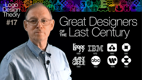
There have been branding designers whose work has naturally been more in conformity with the core Principles. We can learn so much by studying their work.
Big Branding Agencies and Studios
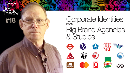
There are also big brand consulting firms and larger design studios that have executed many of the brands we recognize today. Many of these identities have withstood the test of time and were kept for decades, while other identities were replaced after only a relatively short life.
3 Core Concepts - Generating Concepts
Corporate Identity Components
Before we try to generate concepts, let us stop to remember that there are four different kinds of corporate identity design components.
Branding Concepts
Among all the different logos and corporate identities that you have ever seen, there are only four basic categories of concepts. They are: 1) Corporate Activity 2) Corporate Ideals 3) Corporate Name 4) Abstract

Knowing Your Client
You will create your best designs when you understand your client’s needs— and even better, when you understand the needs of your client’s customers, because they are the real audience for any corporate identity.
Branding Concepts:
Self-Brainstorming
Group brainstorming is an advertising technique for generating ideas. Self-brainstorming is a technique you can use alone to generate more and better branding concepts. Here's how.
4 Core Principles - 7 Deadly Sins of Logo Design
Blowout
For most viewers of this video, the word “branding” naturally conjures up images of logos, ads and labels. Branding in the modern sense actually has its origins in a practice that is thousands of years old. Agricultural branding of cattle practiced today is very old. It didn’t start with cowboys in the Wild West; it dates all the way back to ancient Egypt. Not only was its purpose the same as it is today—to identify whose cow was whose—but the nature of those brands was similar to modern cattle brands. They were fairly simple, and they had to be easily recognized. The purpose of a cow brand is the same as a corporate identity or brand in modern marketing: to identify the owner.
Deadly Sin of Logo Design #1:
Can't Work in Solid Black
Every identity ought to be able to work in one single flat color, like black. Even if black isn’t the official “corporate” color, if the design doesn’t work in black, it doesn’t work.
Deadly Sins of Logo Design #2:
Lack of Mass
Mass gives an identity visibility at a distance or in small sizes. The shapes that make up the identity should not be lightweight or thin. An identity with insubstantial and flimsy parts is ineffectual and visually feeble.
Deadly Sins of Logo Design #3:
Obscure Contrast
Legibility is readability, the capacity to be correctly perceived or clearly deciphered. It is necessary in every brand design. Legibility is a function of contrast. And contrast is a function of value. It doesn’t matter so much what the hue or saturation is in the colors. What matters most for contrast is sufficient difference in value. Any logo that has low contrast–and therefore low legibility–has failed its very reason for being: to be clearly seen and read.
Deadly Sin of Logo Design #4:
Wayward Parts
Wayward parts in a brand design means there is visual conflict between the elements, parts of a brand design that don’t fit or harmonize with the rest or elements are not compatible or are mismatched in some manner.
Deadly Sin of Logo Design #5:
Overlapped Elements
Unefined shapes can mean poorly drawn shapes. It happens at all levels of branding. Vector art is the medium in which all identities should be created, but it can be deceptive. It can give the impression that shapes are better than they are because the edges are crisp and clean without necessarily being well rendered or refined.
Deadly Sins of Logo Design #6:
Unrefined Shapes
Unefined shapes can mean poorly drawn shapes. It happens at all levels of branding. Vector art is the medium in which all identities should be created, but it can be deceptive. It can give the impression that shapes are better than they are because the edges are crisp and clean without necessarily being well rendered or refined.
Deadly Sins of Logo Design #7:
Tiny Elements, Thin Lines
Thin Lines and tiny elements is a frequent fault of branding design that relates to both imagery and to typography. We have already dealt with the problem of overall mass. A similar but distinct issue is that of tiny elements or thin lines, even when found in a logo that has sufficient overall mass.

What's left?
Some designers may think these Seven Deadly Sins are just my opinion, and as such, may be easily ignored, but they would be wrong. Each one is rooted in the way humans see and the physics of light and vision or the physics of printing or web reproduction. Some people feel unduly limited when they become acquainted with the Seven Deadly Sins of Logo Design. But they really are your friend.
5 Core Principles - Visual Techniques of Logo Desi5 gn
Logo Design Visual Treatment #1:
Containment
I see Containment in two ways: Shallow Containment and Deep Containment. Whereas Shallow Containment gets overused in branding, Deep Containment still can be an invaluable tool that every designer needs to know about.
Logo Design Visual Technique #2:
Planar or Silhouette
Ligatures and flourishes (or swashes) are typographic combinations and decorations are another tool in a branding designer’s toolbox. Ligatures and flourishes (or swashes) will be useful mostly as options for wordmarks and monograms because they are typographic in nature. Indeed, employing either technique can change an ordinary signature into a wordmark.
Logo Design Visual Technique #3:
Fragmentation
Fragmentation is a technique that can provide many of the benefits of shading without the drawbacks, as long as you follow some easy guidelines. Let’s talk about it. A design can be broken up into smaller portions using stripes, dots, triangles or any other repeatable solid shape. These shapes can be tapered (in the case of lines) or rendered at different sizes (in the case of dots, triangles or squares.
Logo Design Visual Technique #4:
Unique Coincidence
When it comes to branding design, every new client’s corporate activity, ideals, name or initials carry unique visual opportunities that will work only for that particular kind of business or name or set of letters.
Logo Design Visual Treatment #5:
Linear Treatment
Creating an identity entirely out of lines has some unique opportunities and some dangers. As with fragmentation, the technique of rendering the whole identity with lines alone risks making the lines or spaces too delicate for clarity in small sizes or viewed from a distance. Drawing lines that are too lightweight for the overall size will make the whole logo too insubstantial (Deadly Sin of Logo Design #2: Lack of Mass). If lines are close together, it is safest to make lines and gaps the same thickness.
Logo Design Visual Technique #6:
Planar or Silhouette
Planar images and silhouettes are used in a surprising number of identities. A planar image is one that renders shadows as a solid dark color, and lighter parts as a solid light color or white, with no shading. A silhouette is similar but uses only the contour of the whole subject and disregards any light falling on it.
Logo Design Visual Technique #7:
Negative Shapes
Negative shapes is an extremely versatile and useful tool for branding designers. Trying to force two concepts together often results in ruining a branding design but negative shapes, as a technique, allows the combining of visual ideas in a way that can work very well.
Logo Design Visual Technique #8:
Essence
In identity design the most important question to ask is not “What can I add to this design?” but rather, “What can I remove? How can I simplify it, reduce it?” and “How can I show the essence of this subject?” As I have stressed before, a good logo is not an illustration or a photograph. It is a symbol that reminds us of something, but it needs to be elegant in its restraint. This has been the whole trend of the corporate-identity design industry for the past century.
Logo Design Visual Treatment #9:
A System of Shapes
The concept “system of shapes” may sound too formal and even a bit daunting to digest, but it is just a way of saying that any design can contain simple, repeated visual elements.
Logo Design Visual Technique #10: Sculpted Type
Sculpted Type is what I call type on a curved baseline. It is a technique that is widely used in branding design today.
6 Core Principles - Color, Typographic & Spatial Iss6ues
Logo and Signature Color Basics
Even a good branding design can be made less effective by poor spatial and color choices. Here are some of those choices.
Advanced Color Issues
for Identities
A branding designer has to foresee different color situations and plan for them in branding design. An identity needs to work in all situations, not just in ideal lighting or at optimal distances. It must be easily recognizable in compromised lighting or less-than-ideal reproduction.
Typographic Issues with Brand Signatures
There are some typographic that all branding designers need to know about typography that change a brand's effectiveness.

Spatial Issues with Identities
Much of the good in a design, even in an exquisite design, can be undermined by poor spacing. Here are some suggestions.
7 Implementing Core Principles of Identity Design

The Danger of Following Trends Blindly
Trends are very popular in the field of graphic design. Is that a good thing or a bad thing? Let’s talk about it.
Able to Work in Solid Black
The branding design world is slowly coming around to conforming with the Core Principles of logo design. Logos that can be reproduced in solid black or any other solid color are increasing.
Having Sufficient Mass
Branding designs are being reworked to give the identities more mass so they can reproduce better and can be seen and recognized easier.
Having Enough Contrast
All sorts of brands are fixing contrast issues to increase their visibility and legibility. Why? Because poor contrast weakens and identity. See what is happening in our industry.
Removing Wayward Parts
Branding designs with parts that don’t work with the rest of the design are a problem. Even non-designers can sense something is not right with the design and it carries a message.
Having No Overlapping Elements
The world of branding design is slowly shifting to be in conformity with the Core Principles of Branding Design. One such shift is to avoid overlapping elements in logos. People are learning that overlapping elements in branding design always hurt legibility and they are getting rid of them.
Making More Refined Shapes
The world of branding design is slowly shifting to be in conformity with the Core Principles of Branding Design. One such shift is to make more refined shapes in logos. Refining shapes is the very essence of design. In branding design it is fundamental.
Eliminating Thin Lines,
Tiny Shapes
Thin Lines and Tiny Shapes are among the most common faults in logo design and many companies that have such logos are getting them fixed.

Good 21st Century
Identity Design Trends
The whole design world is inexorably feeling its way towards the Core Principles, as we saw in previous videos. This means that there are some solid trends in branding design. We can see with our own eyes that when identities are redesigned to be more in conformity with the Core Principles, it is always a positive change.
What Famous Fails In Branding
Can Teach Us
I posted three teaser videos before beginning this main course of Logo Design Theory. Those examples from Xerox, AT&T and United Airlines should have shown that even when big companies paid big bucks and hired world-famous branding firms, it does not guarantee a useable logo if any of the Seven Deadly Sins of Logo Design have been committed. What can we learn from the experience of these three companies?

Learning From the Past
We will learn very little if we only learn from our own mistakes. A much wiser and faster way is to learn from the mistakes and successes of others. This is particularly true in branding design.

Avatars and Favicons
Some people might say that these ideas of the Core Principles of Logo Design are old fashioned, but they couldn’t be more wrong. What is more modern than social media, than avatars and favicons? It reenforces the principles we've been talking about.

Working At Creativity
Some people say you can’t change your own level of creativity. I disagree. I think there are, indeed, things we can do to increase our own creativity.

Working the System
As we near the end of this course, you may be wondering, “How do I implement what I’ve learned here?”

Final Words
This is the last video in the Logo Design Theory Course. Here are some final words I’d like to leave with you.
