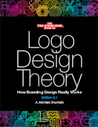
Logo Design Theory
How Branding Design Really Works

Ivan Chermayeff,
world famous designer of some
of the most iconic brands of the last several decades,
said of this book,
“At last
somebody actually understands
what identity design is all about
and how it is to be accomplished.”

A Branding Book Like No Other
• Adhering to the Core Principles is why some corporate identities have been used for decades, even more than half a century, and still look fresh, while others look dated and tired in only a few years.
• The Core Principles of corporate identity design don’t change, they transcend fad and fashion.
• Learn that there are only four different kinds of concepts for corporate identity, and how that can help you generate more and better identity concepts.
• Avoid the Seven Deadly Sins of Logo Design.
• Discover visual techniques that can turn a common concept into an uncommon, even remarkable identity.
• Save yourself years of fruitless trial and error by learning these Core Principles.
All of this comes with clear, real world examples. You’ll see with your own eyes concepts and principles not found in any other book on branding design.
And they work!
Design: A Small Part of the Cost
There are many approaches to corporate identity (logo design) these days. Some companies spend hundreds of thousands of dollars, not just getting a new design but the implementing it on stationery, website, signage, vehicles, corporate promotional materials, products and packaging.
Have you ever seen a new identity and thought the old one was better? Have you seen a logo on a sign for the first time and couldn’t tell what it was? Have you ever looked at your own identity but found that in certain situations it didn’t print well? Or it costs more to reproduce on vehicles and even stationery? It just doesn’t work?
Fads in logos come and go. Logos that appeared cool and cutting edge one year end up looking dated and cliché the next year.
One has to wonder: are there fundamental logo design principles that don’t become obsolete? Such principles exist in music, chemistry, engineering. Why not in branding design?
Such principles do exist and they are explained in the book Logo Design Theory: How Branding Design Really Works.
Logo Design Theory: How Branding Design Really Works
Available wherever books are sold. Order your copy today.
Logo Design Theory - Table of Contents
Introduction
Section One:
Foundational Principles of Graphic Design
1 Professional, Prima Donna or Artsy-Fartsy?
2 Seeking True Principles in Art and Design
3 What is Creativity?
4 What is the Purpose of Graphic Design?
5 Form Follows….?
6 Basic Principles of Design
7 Legibility and Contrast
8 Color and Contrast
9 The Doctrine of Coincide or Contrast
Section Two: Branding Fundamentals
10 A brief Overview of Branding History
11 Evolution of Some High Profile Identities
12 Great Designers of the Last Century
13 Big Branding Agencies and Studios
Section Three:
Core Principles: Generating Concepts
14 Corporate Identity Components
15 Identity Concepts: Corporate Activity
16 Identity Concepts: Corporate Ideals
17 Identity Concepts: Corporate Name
18 Identity Concepts: Abstract
19 Knowing Your Client
20 Self-Brainstorming
Section Four: Core Principles
Seven Deadly Sins of Logo Design
21 Blowout
22 Deadly Sin of Logo Design #1:
Can’t Work in Solid Black
23 Deadly Sin of Logo Design #2: Lack of Mass
24 Deadly Sin of Logo Design #3: Obscure Contrast
25 Deadly Sin of Logo Design #4:
Wayward or Parts Out of Harmony
26 Deadly Sin of Logo Design #5:
Overlapping Elements
27 Deadly Sin of Logo Design #6: Unrefined Shapes
28 Deadly Sin of Logo Design #7:
Tiny Elements, Thin Lines
29 What’s Left?
Section Five: Core Principles: Visual Techniques
30 Visual Technique #1: Containment
31 Visual Technique #2: Planar or Silhouette
32 Visual Technique #3: Fragmentation
33 Visual Technique #4: Unique Coincidence
34 Visual Technique #5: Linear Treatment
35 Visual Technique #6:
Ligatures, Swashes and Flourishes
36 Visual Technique #7: Negative Shapes
37 Visual Technique #8: Essence
38 Visual Technique #9: A System of Shapes
39 Visual Technique #10: Sculpted Type
Section Six: Core Principles
Color, Typographic & Spatial Issues
40 Logo and Signature Color Basics
41 Advanced Color Issues for Identities
42 Typographic Issues with Signatures
43 Spatial Issues with Identities
Section Seven:
Implementing Core Principles of Identity Design
44 Following Trends
45 Deadly Sin of Logo Design #1 Fixed:
Able to be in Solid Black
46 Deadly Sin of Logo Design #2 Fixed:
Having Sufficient Mass
47 Deadly Sin of Logo Design #3 Fixed:
Having Enough Contrast
48 Deadly Sin of Logo Design #4 Fixed:
Removing Wayward Parts
49 Deadly Sin of Logo Design #5 Fixed:
Having No Overlapping Elements
50 Deadly Sin of Logo Design #6 Fixed:
Making More Refined Shapes
51 Deadly Sin of Logo Design #7 Fixed:
Omitting Thin Lines or Tiny Shapes
52 21st Century Identity Design Trends
53 Famous Fails
54 Correction at a Cost
55 Learning From the Past
56 Responsive Websites, Avatars and Favicons
57 Working at Creativity
58 Final Words
Appendix 1: Glossary
Appendix 2: Logos by A. Michael Shumate
Index

