You Can’t Beat Success
When we look over the last century of branding design we see thousands upon thousands of companies that have each proudly worn their corporate identities. Virtually all of them have changed their identities, not just once, but many times. And at no small expense.
And yet some companies have not had that misfortune. Their identities have stood the test of time. Some for thirty, fifty, even a hundred years. If you will look closely, every one of them has avoided the Seven Deadly SIns of Logo Design (as described in the earlier posts on the Seven Deadly Sins of Logo Design).
Not committing any of these sins does not guarantee superb design, but committing them does guarantee that such an identity will not work and will likely need to be replaced sooner or later. And as we have already stressed, such changes are attended by significant expenses that could otherwise have been bypassed.

Whole Identity Aspect
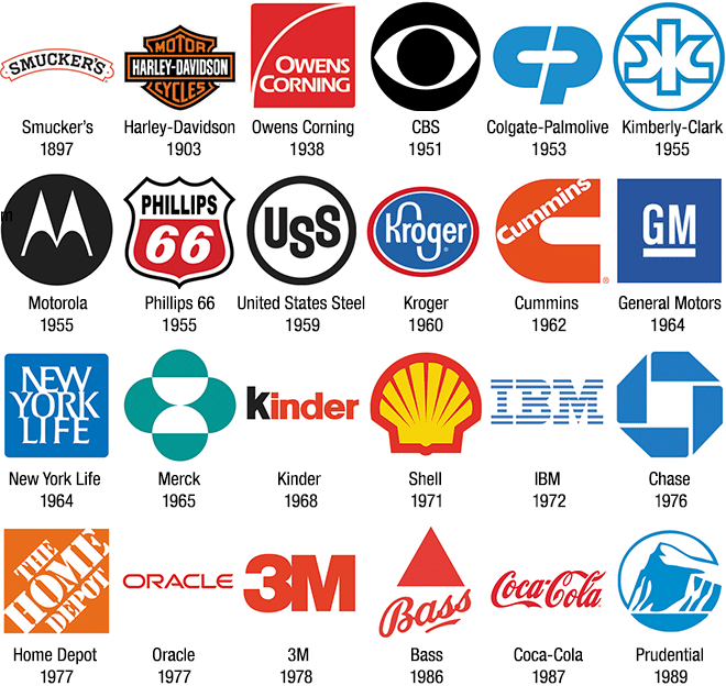
In the preceding examples, can you see how much smaller the four wordmarks (Smuckers, Kinder, Oracle, Coca-Cola) are in a horizontally limited space like this grid? This is because of their overall aspect, which is their relative width versus height. Most words used for wordmarks will naturally have a wider-shorter aspect than most logos and, therefore, they will appear smaller in any situation where the horizontal space is limited, such as when the space is limited by columns: one column newspaper ads or Yellow Pages ads or even a company’s own publications.
This is why there is a natural advantage to an identity consisting of a logo or monogram accompanied by a signature instead of a wordmark. With a wordmark, you only have one overall shape. With a logo or monogram plus a signature, there are different arrangements and size relationships that can maximize visibility in different design layouts, as seen in the post on Spatial Issues with Identities.
Generally speaking, aspect will be harder to deal with when there are more letters in the functional corporate name. A name with four to eight letters is very comfortable to design with. Names with ten, twelve or more letters become increasingly difficult to manage.
As was mentioned in the post on Typographic Issues with Brand Signatures, one good way to compensate for long names is to use more condensed fonts.
The Rebranding of Caterpillar
Around 1989, Marshall Strategy was hired to do a major rebranding for Caterpillar, the heavy equipment manufacturer. Prior to this, Caterpillar had a serviceable (if not inspiring) logo but the long signature was made even shorter vertically relative to its width by using an extended font. Bad call.
In the new identity, Helvetica Condensed Bold was used to excellent effect, not only giving the signature more height relative to its width, but more mass as well. The incorporation of the yellow wedge does not interfere with legibility and reminds viewers of the corporate color used to paint all their equipment.
The shorter version of the identity to just “CAT” remains perfectly balanced with the wedge. Going with the shorter name recognizes the way most customers refer to them, similar to how Federal Express changed its functional name to FedEx.
Caterpillar’s successful brand change is one of the rare times when trading a logo and signature for a wordmark was a smart move. However, trading a logo and signature for just a plain signature usually results in an overall weaker identity.

Middle and Bottom: the new Caterpillar identity by Marshall Strategy. The new identity has so much more mass than the old one, a quality consistent with the kind of heavy equipment that they build. Abbreviating the name to just CAT is even better and will likely become the norm for them going forward.
Adapted from Logo Design Theory: How Branding Design Really Works
